SOJOURN
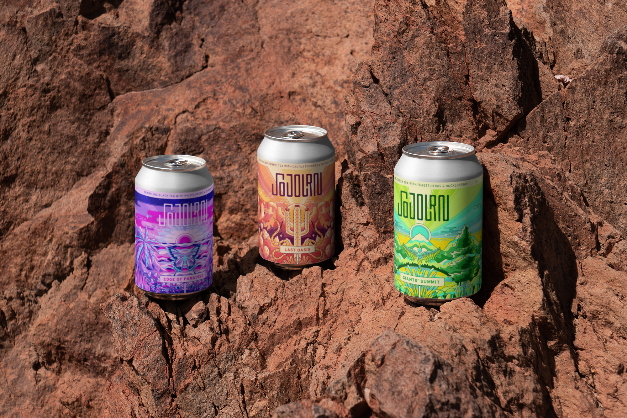
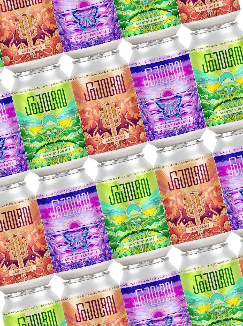
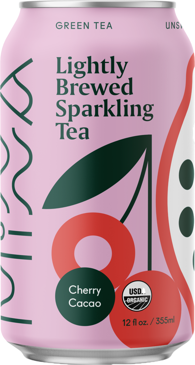
Inspired by the artistry of craft beer labels, Sojourn defies trendy minimalist non-alcoholic beverage design in favor of bold, maximalist, and colorful illustration. This line of sparkling teas highlights three key West Coast destinations, each with their own color palette, flavor profiles, and aesthetic. Whether you are relaxing on the beach, embarking on a summer road trip, or just in need of a short escape, every sip of Sojourn sparkling tea will transport you to a place of freedom, adventure, and boundless possibilities.
* Visual Identity
* Packaging
* Naming
This project was completed as my senior thesis at Portland State University.
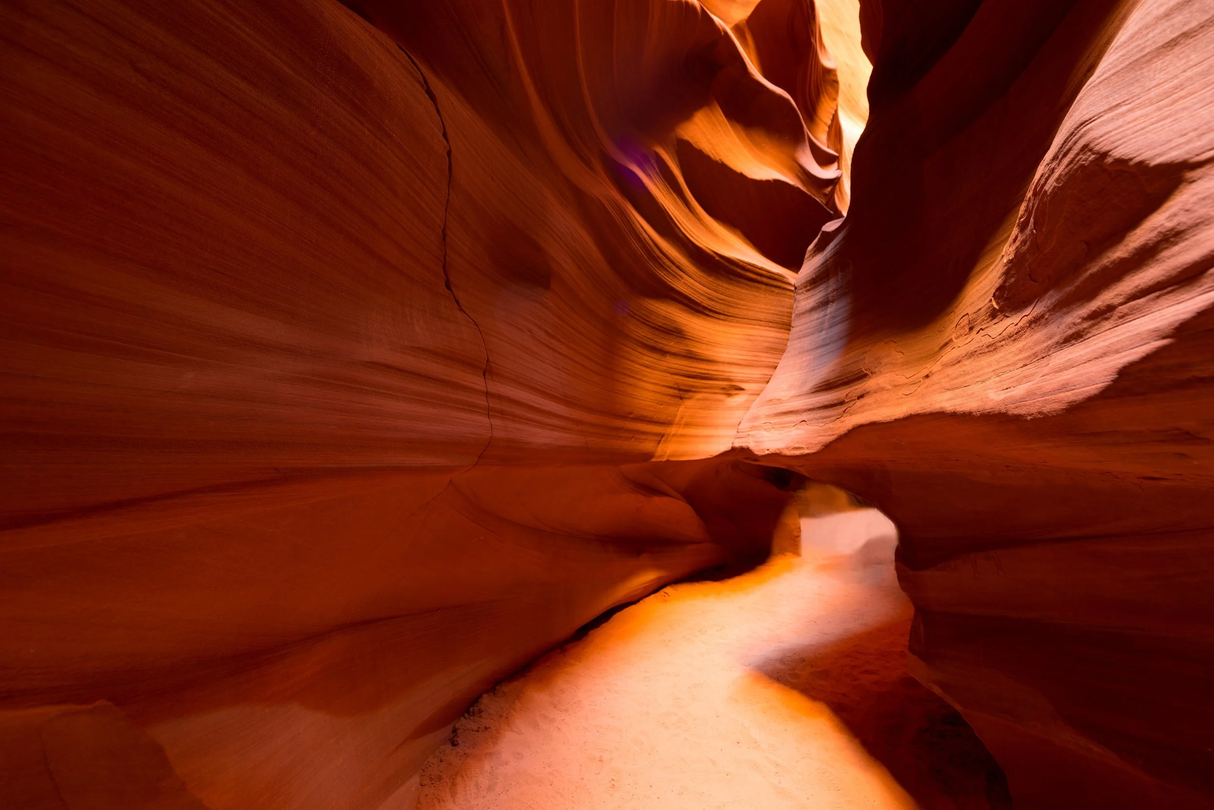
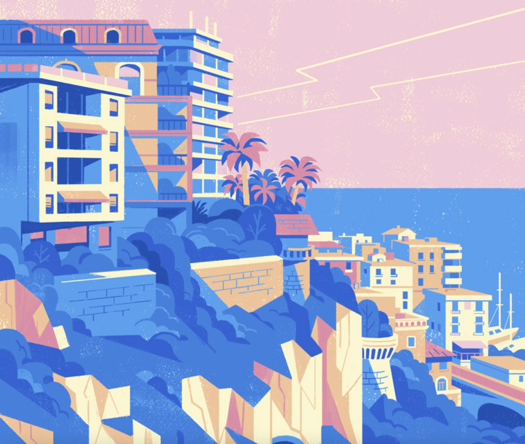
Each label was inspired by three different landscapes in the western US: the SW desert, the California coast, and the PNW forests, respectively.
THE ADVENTURE STARTS HERE
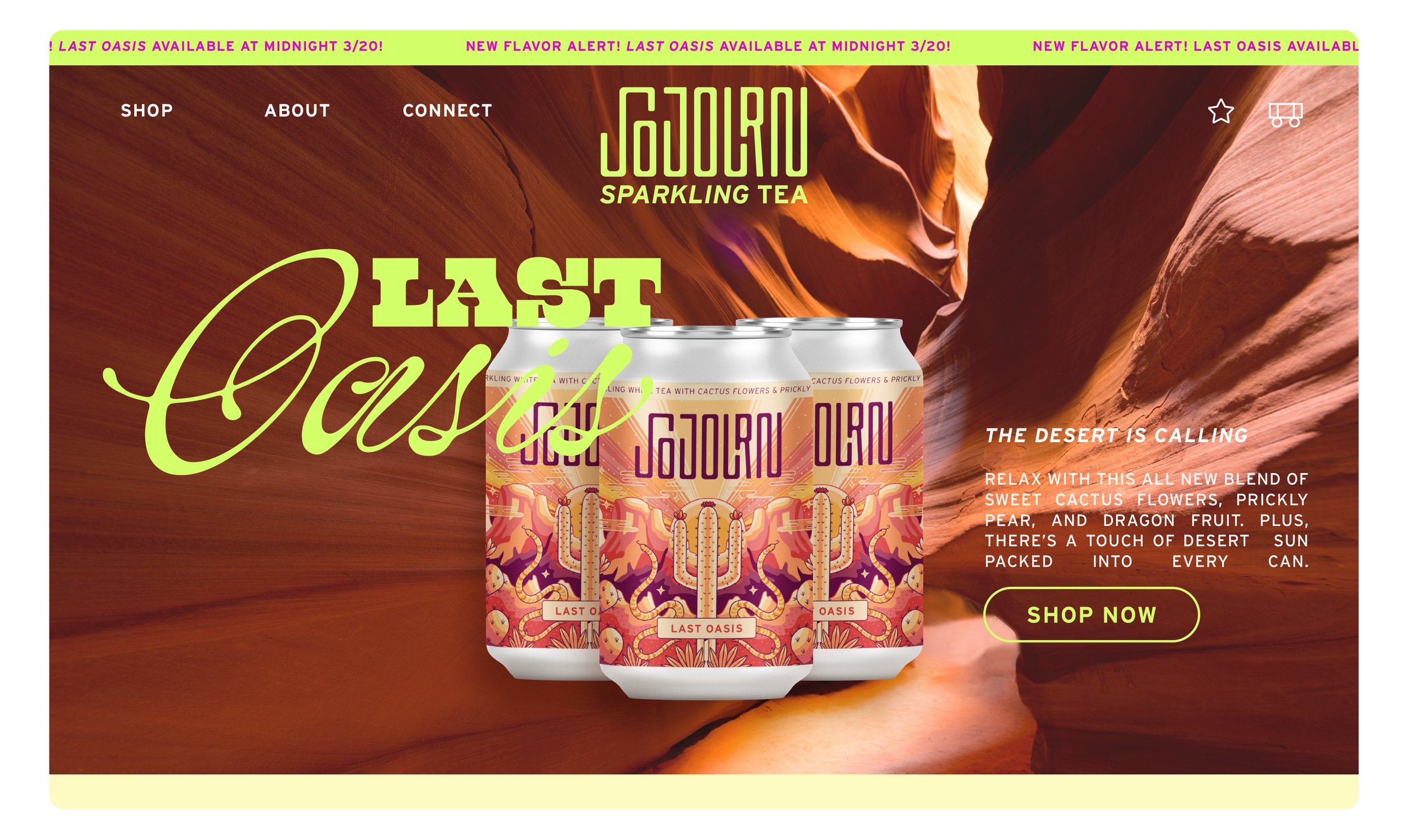
Sojourn was created to find a way to infiltrate the oversaturated beverage industry with a brand that puts adventure and storytelling first.
Special thank you to Meredith James and Garrett Close for their mentorship and support throughout this project.
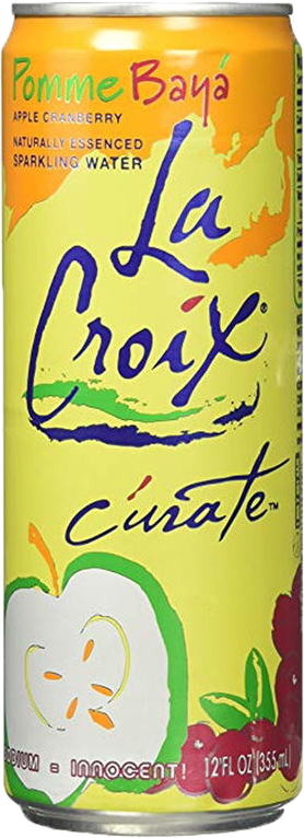
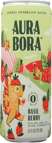
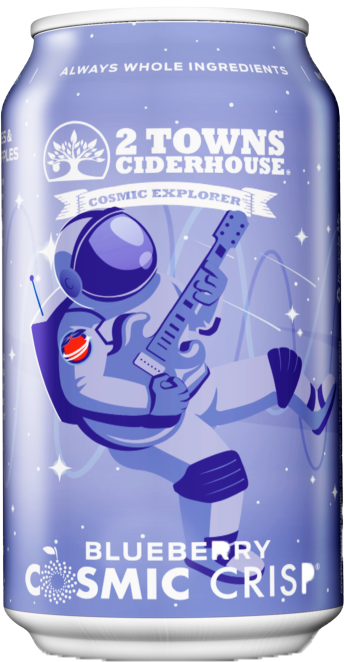
PREPPING FOR PRINT
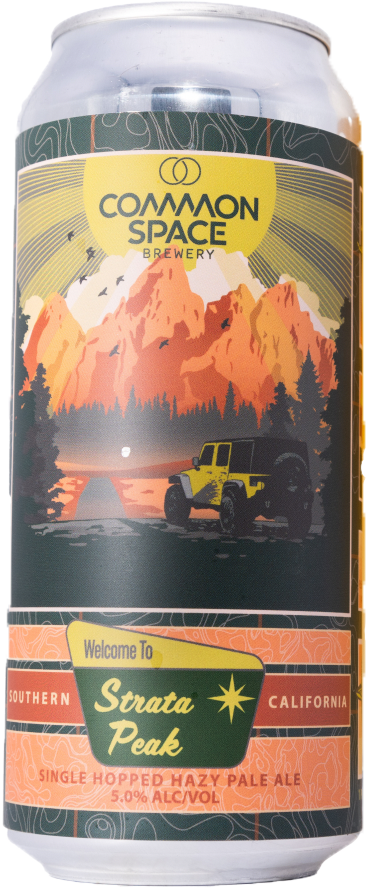
The final step of this project was to prepare the files for print. This consisted of adjusting colors, testing for legibility, and sourcing cans. The finished project succeeds in its visual impact and fully brings my design concept to life!
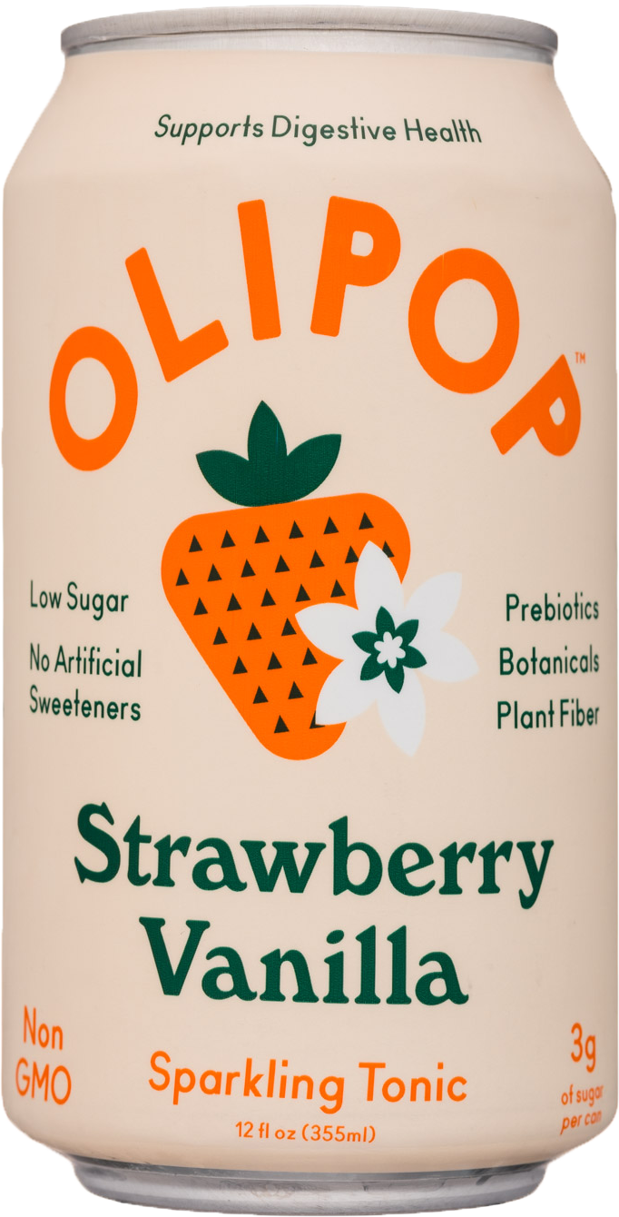
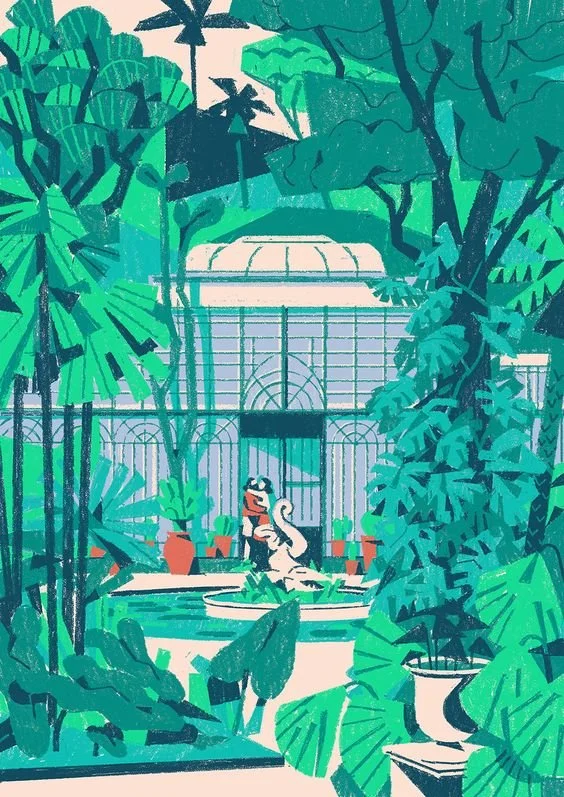
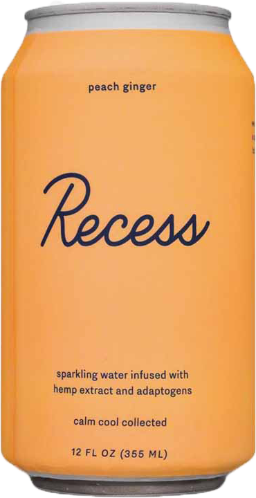
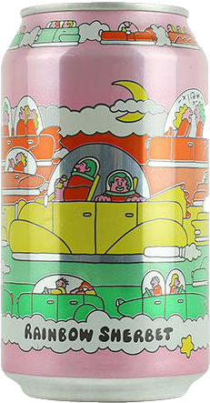
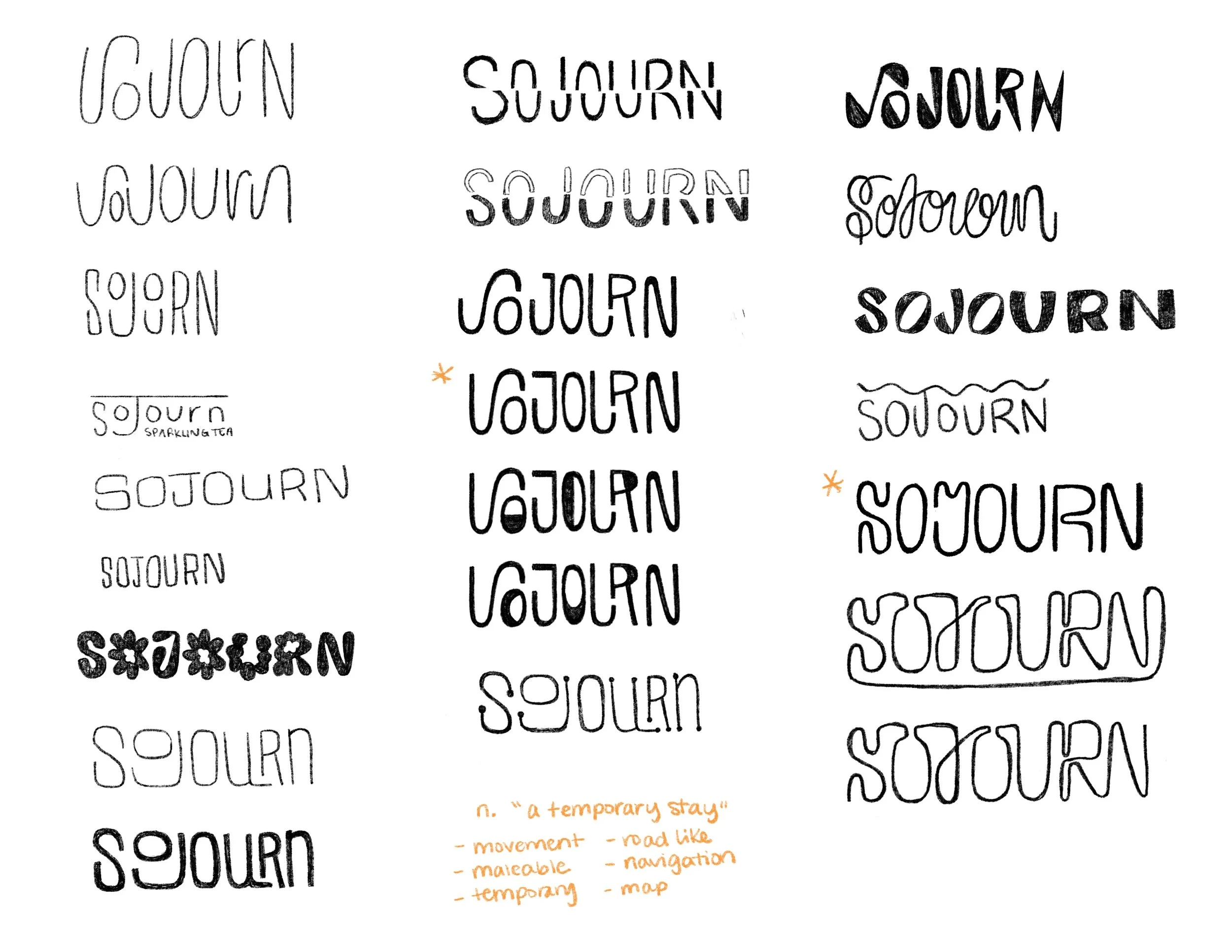
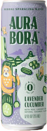
The beverage aisles are full of trendy, vibrant, and visually appealing brands, but many lack a creative personality. With many non-alcoholic seltzer brands turning towards a similar minimal retro visual aesthetic, it’s hard to pinpoint what makes their brand unique. Drawing inspiration from indie breweries who view their labels as a canvas for creativity, I developed a visual system that puts illustration and emotion at the forefront.
VISUAL EXPLORATION
Working within a desert theme, I explored several illustration styles to see which could work best as a design system across multiple labels. After completing these style tests, the third exploration was chosen as the final visual style.
Utilizing symmetry, color blocking, and layered elements, I created visual balance across the can label to fully maximize the space and give an immersive sense of place.
BUILDING COLOR PALETTES
Color plays a vital role in the story that these labels tell. Inspired by the colors that already exist in the chosen landscapes, the audience is transported into the world of each beverage.
The final color palettes are bright, vibrant, and maximal, yet restrained.
REFINING TYPE AND VISUALS
Sojourn’s big personality not only comes from its whimsical illustrations, but also from playful and unexpected type pairings.
The Chasing Sunsets Variety Pack combines letters from the three beverage name typefaces. This combination creates unity within the brand while building on the existing type structure.
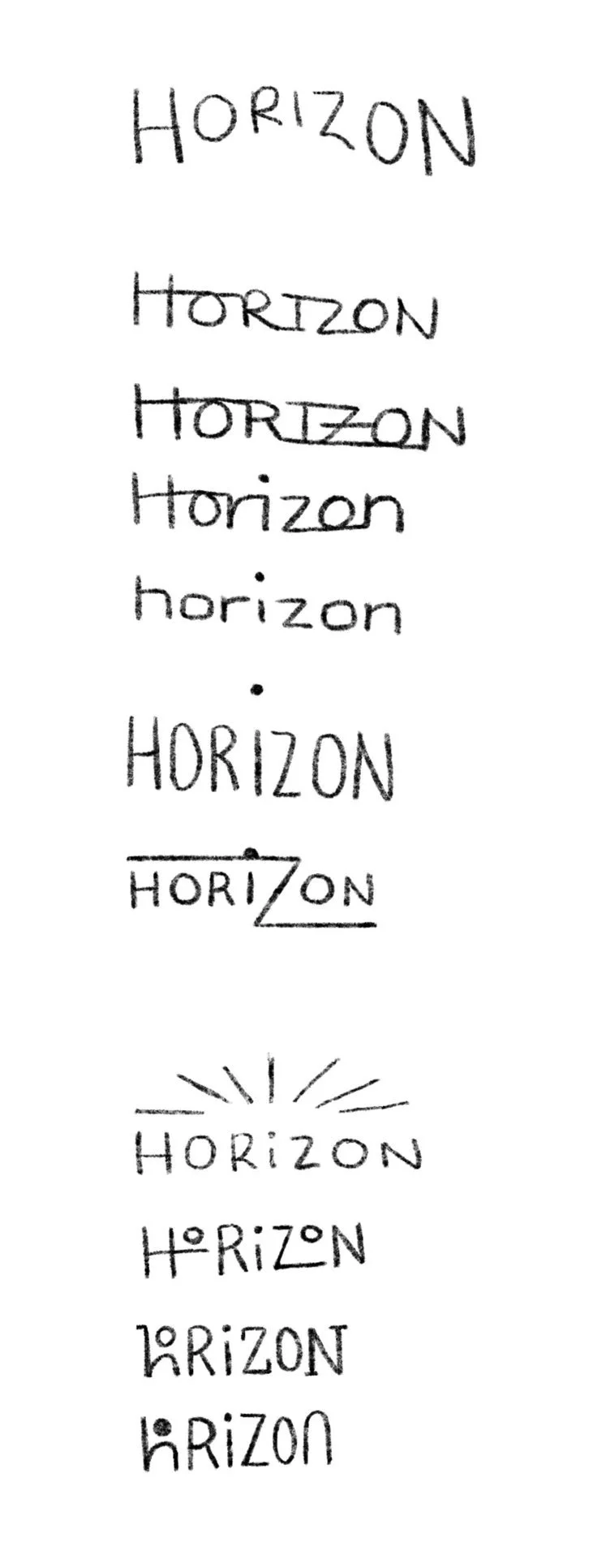
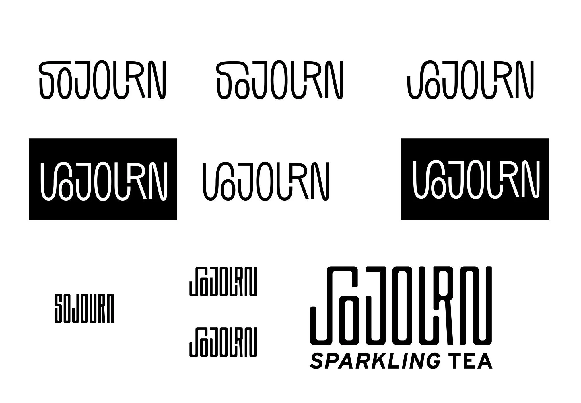
LOGO DEVELOPMENT
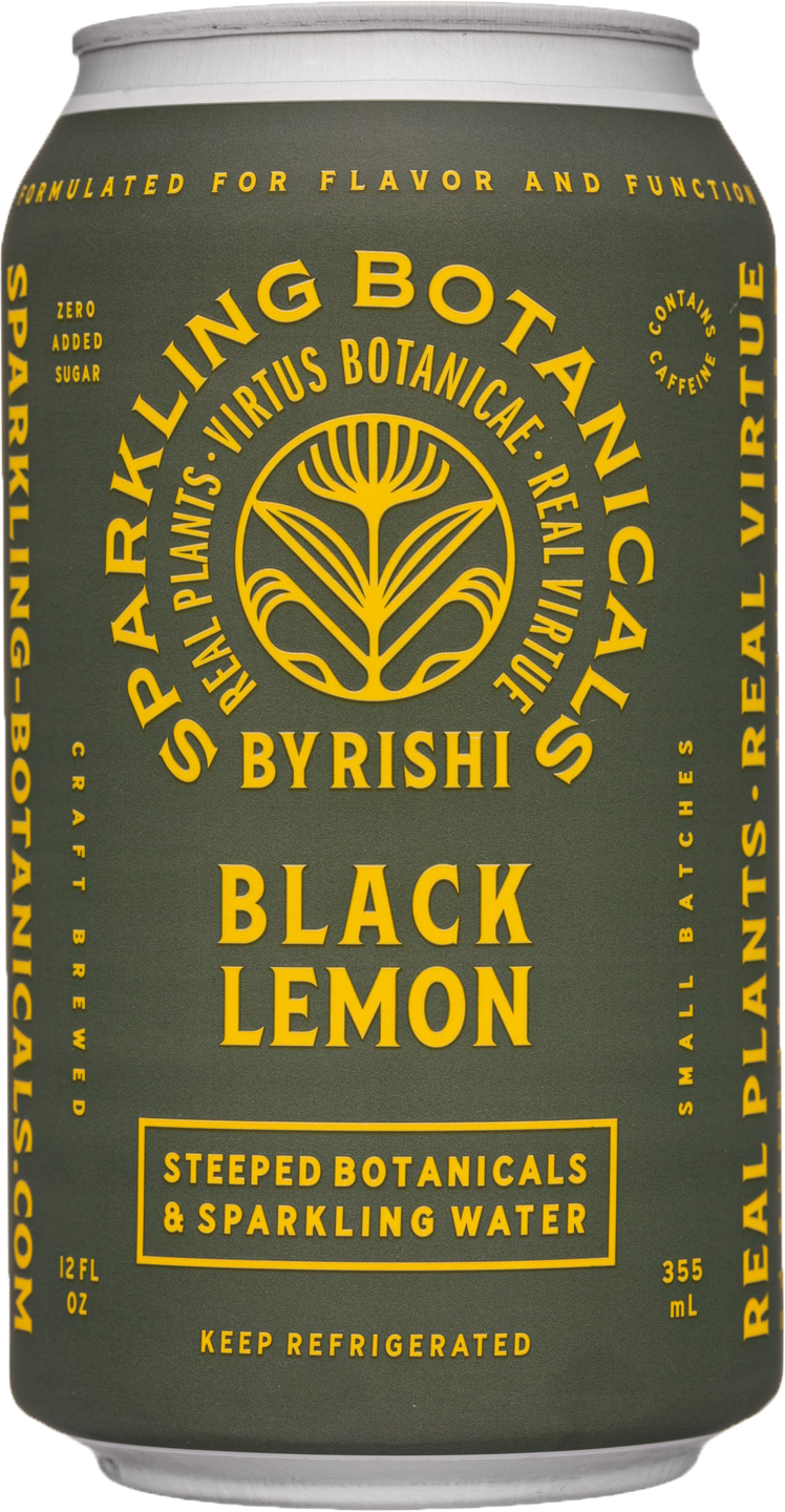
After narrowing down a short list of naming options, sojourn (n): a temporary stay, stood out as it invokes spontaneity, meaningful moments, and taking the time to enjoy something small—like a delicious sparkling beverage!
The working design was inspired by the winding roads that curve throughout the beautiful landscapes of the US.

Final logo
TRIAL RUN
Many of these initial ideas were scrapped, but the theme of travel and adventure created a strong starting point for the brand.
